Hide unwanted pairings from your personal suggestions
A thumbs-down now hides that pairing for you across profiles and Discover. Restore a hidden pair from its typeface page whenever you want.
New tools, thoughtful improvements, and small fixes. Follow the making of Type.lol, the independent type discovery platform.
A thumbs-down now hides that pairing for you across profiles and Discover. Restore a hidden pair from its typeface page whenever you want.
Refresh pairings to explore different companions, and open “Why this pairing?” to see the evidence behind a suggestion. Discover and typeface profiles now share the same role and script checks.
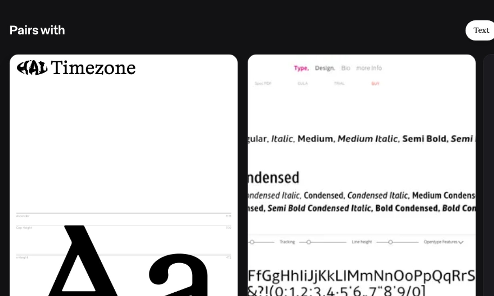
Pairing specimens share one height and use the width of their artwork. The reference stays fixed while you browse suggestions, without cropping either side of the images.
Pairing cards show specimens at their original proportions in a shorter frame. Previously loaded card images stay visible when remounted while browsing.
Screenshot previews resize proportionally instead of cutting off the sides. Typeface names and specimen text stay visible inside cards.
The Pairs with row offered empty cards reading Specimen unavailable, and sometimes a foundry's logo instead of a typeface. Suggestions now need something to show, and the row shows fewer good options rather than filling up with placeholders.
Filter dropdowns on a phone were cut off at the filter bar, so the options below the fold could not be reached. They now open over the page at full height, in table view and everywhere else.
Browse foundry and typeface updates in Feed. Filter by entity, follow foundries for a personal view, and save typefaces to collections. Large imports stay together in one row.
Guest search results use the collection view with top-aligned artwork, a clear save action and one compact status line.
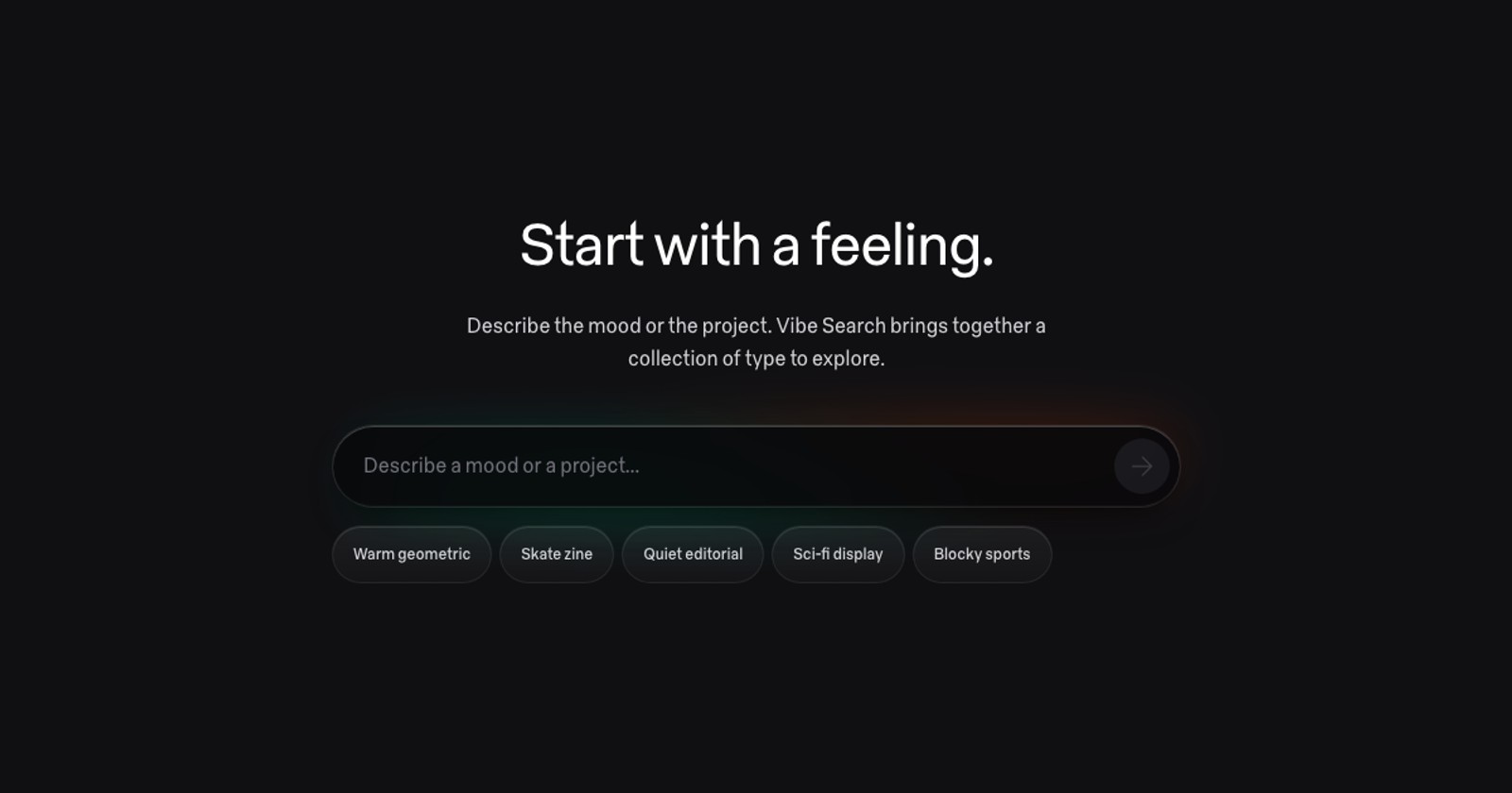
Vibe Search used to ask for a sign in before it would show you anything. Now anyone can describe the type they are after and get a real set of results back, and signing in is only needed to save that set as a collection. Guests get three sets. Signed-in accounts get ten free searches a month, which reset on the first, and Pro stays unlimited.
Fonts, details and credits form three columns on wider screens. Upright and italic styles share a row, and technical font data remains available on demand.
Browse cards show images without loading a whole website inside each one. Enable Live previews with I, or hold ⌘ over one card to interact; dedicated entity-page previews still open live.
Foundry, typeface, designer and collection sections now share Discover’s larger, sentence-case headings, with counts kept small and easy to scan.
The fixed reference has a stronger shadow, scrolling cards clip cleanly at its edge, and previews fill their cards without empty image bands.
Keep the current typeface in view while scrolling through pairing suggestions. Larger specimens, a compact role picker and quiet feedback controls make comparison easier.
Browse cards show images without loading a whole website inside each one. Enable Live previews with I, or hold ⌘ over one card to interact; dedicated entity-page previews still open live.
Explore text, display and mono companions on typeface pages. Leave private, reversible feedback to help refine suggestions, with varied choices and no public vote counts.
Typeface previews now start with the live foundry page, followed by specimens and images. Admins can open the enrichment inspector directly from a typeface page.
Your fonts is a place in the sidebar like Discover or Collections, instead of a separate page with no navigation and a text link back.
You can configure a license and fill a cart without an account. You still create one to check out, and your cart comes with you.
Everything you are licensed to use now sits in one list, whether you bought it here or somewhere else, with the look of the foundry manager.
A refund now emails you what came back and when to expect it, and tells the foundry what was reversed. Purchase emails show sales tax and the real total.
Your analytics choice is now saved to your account and can be changed any time under Settings, Privacy & Sharing. Signing in restores the choice you already made, so the banner no longer returns after a browser clears its storage or when you switch devices.
Search now ranks complete words above partial name matches, so searching HAL brings HAL Typefaces into the first results. Strong name matches appear above filter suggestions, which also put stronger matches first, and punctuation-only searches no longer return unrelated names.
The detail panel offered a trial download for any typeface whose foundry advertises trials, and the download then failed because the trial files live on the foundry's own site. It now downloads only what we host, and links to the foundry for everything else.
A purchase now completes the moment payment succeeds. Paying the foundry happens separately, so a delayed payout can never hold up your files, your license or your receipt email.
Choose how to browse Foundries, Typefaces, and Designers from the selected sidebar row. On phones and with the sidebar collapsed, the menu sits beside the page title. Each page remembers your last choice. Discover also has a loading layout that matches its introduction and specimen orbit.
Preview the daily typeface selection and open a typeface profile while the rest of the catalog loads.
Browse Studies with clearer headlines, more readable descriptions, and artwork presented alongside the featured story. A serif and sans serif specimen introduces the classification study.
Messages, cards and status updates in an Inbox conversation now show the date next to the time, so an older message is easy to point back to. Hover a timestamp to see the full date.
Checkout now ends on a confirmation of what you bought, with your receipt and a download button, instead of dropping you on your font library.
Searching "gs t" now finds GS-Type, the same as "gs-t" does. Hyphens, dashes, underscores and slashes count as spaces in names and in what you type, so the way you type a name no longer decides whether it shows up.
Advance the Features headline with the Next typeface button. Features and Marketplace now share rounded actions, and marketplace stats put their labels first.
Every product window on the features page now shows Type.lol the way it looks on a laptop, scaled down to fit your phone, instead of a phone-sized rendering of each screen.
Discover holds still on a phone. The page no longer slides sideways as you scroll, and the specimens at the top now answer to a swipe instead of drifting past the one you were looking at.
A profile on desktop no longer opens on one giant carousel. It opens on the person: their numbers, their collections, then the typefaces, foundries and designers they follow.
People cards no longer look like designer cards. Each one now has a cover, a round avatar and a row of numbers that shows what that person does on Type.lol.
Long conversations with Type.lol are easier to find your way around. Search the conversation you have open and step through every match, or reply to one message so it is clear what you are answering.
Rename styles and open file actions without losing your keyboard focus. Customer spend stays separate by currency, and exports include license configurations, formats, styles and refund status.
Browsing on a phone, every card was quietly running the foundry's whole website behind its picture, with that site's own animations playing under your thumb, and cards unloaded and reloaded as you swiped through a collection. Phones now show the still preview on browse surfaces, the way Lite Mode does on desktop, so scrolling is smooth and nothing flickers back in. Foundry, typeface and designer pages keep their live previews, where they are the point.
On a phone, the menu, back and search bubbles on foundry, typeface, designer and collection pages left the screen as soon as you scrolled past the top of the page, leaving a blank band with no way out. They now stay for the whole page. The page title no longer runs through the Prepare cart or Follow pill beside it, and a collection you had just left no longer comes back under the Discover header.
First-time and incognito visitors could land on a foundry page with no typefaces and no designers, and the Typefaces view could say nothing was found. The catalog now arrives in full on a cold visit, and a flaky connection no longer empties the page.
The marketplace application now files your ownership claim from what you already told us. Signed in, your account email and your own foundry are filled in and the claim goes with the application. Signed out, you can create an account or sign in right after applying and the claim is filed the moment you are in. Nothing to fill in twice.
The marketplace and features pages read cleanly on a phone. The closing headline no longer runs off the right edge, the hero glyphs stay clear of the headline, and the column grid thins from twelve lines to four so it stops ruling through every paragraph.
The foundry, typeface and designer pages got a new shape last week and Discover was still the old one. Its section headings, rails and loading states now match those pages, so going from the feed to a page and back no longer shifts every edge. On a phone the rails are rails again: entity-sized cards you can flick through, instead of one screen-tall card with the next one peeking in at the side.
Dropping font files into the typeface editor created the styles but silently refused every file, so a family arrived as named styles with nothing behind them. Storage was rejecting uploads from foundry owners; only site admins could get a file in. Owners can now upload, replace and remove their files, and if an upload is ever refused the editor says which file and why instead of finishing quietly.
Every vibe search creates a collection, and free accounts are capped at three collections, so after three searches the prompt only ever opened the Pro upsell. Vibe search now has its own allowance instead: ten free searches, exempt from the collection cap. The prompt shows how many you have left, and when they are gone it says so and offers Pro, which has no limit.
In the typeface editor, click a style's name to rename it, then press Enter or click away to save. A misnamed style with files already uploaded no longer has to be deleted and re-uploaded to fix its label. When a first drop goes wrong, a Remove all control at the top of the styles grid clears every style and its uploaded files after one confirmation that states what will go. Removing a style also clears its files from storage. Styles that have been sold or trialed stay, and the confirmation names them; their remove buttons are shown disabled with the reason rather than hidden. A logged download no longer pins a style.
Drop a Light, Medium or Extra Bold file into a typeface and it is now named Light, Medium or Extra Bold. Fonts exported with style linking carry "Regular" in their legacy subfamily name for every weight except Bold, so a whole family used to arrive as a column of Regulars. The editor now reads the typographic style name first and falls back to the weight class when a file only carries the placeholder. Styles created in one drop are ordered by weight, an ExtraBold file no longer matches the Bold style, and the catalog sorter's style picker shows each style's weight so identical names can be told apart.
Foundry, designer and collection pages now show their followers as a small group of avatars with the count, and the count opens the list. A typeface page shows which public collections it sits in, with the collection tiles, and each one opens. Only what is already public appears: followers whose own library is public, and collections that are public. Anyone who keeps their library private stays inside the count and nowhere else, and the list says so.
A foundry applying for the Marketplace beta now hears from us at each step. Signing up gets a receipt that says you are on the list and we will email you when you are in. Being let in gets an invitation with a private link that walks you through your account, ownership, and foundry setup. And when your ownership claim is approved, a welcome email opens foundry setup, which had been a silent step until now. All three carry the marketplace artwork.
Paste a Type.lol link into Slack, Twitter or Messages and the preview now shows the page inside the same product window the marketplace uses, with the page's route in the address bar. The homepage, Features, Studies and Font TV each get their own card captured from the live app, and every foundry, typeface, designer, collection and theme page gets a matching one built on the fly. Font TV links stopped unfurling as the homepage.
Every page was downloading a large graph-drawing library it never used, about a third of all the script on a typeface page. It is gone from the load, so a typeface page arrives with 28% less to fetch. The brief hitch a couple of seconds after a page appears, while the catalogue finishes settling in, is also about half as long as it was.
On a phone, a profile's library was below the bottom of the screen with no way to reach it: the page did not scroll, so collections, typefaces, foundries and designers were there but unreachable. The page is now one long scroll, laid out the way a foundry page is, with each part of the library as its own row. Claimed foundries and designers sit under the name, the actions read as a row, and follower counts show correctly on other people's profiles, where they used to read zero.
A collection on a phone now has the same shape as a typeface or a foundry: the tile, the name, who made it, one main button, and a row of actions, with the typefaces below. The tab strip is gone; what it held is either under the name or in a details row at the end. Search is a tap away from the top of the page, as it is on every other entity page.
Typeface, foundry, designer, collection and profile pages on a phone now carry a search bubble at the top right. Before this, searching from one of those pages meant going back to a browse view first.
On the dark theme the search field had nearly vanished into the top bar, and the keyboard hint inside it had vanished completely. Both are readable now, without a border. The filter button also stops lying: it used to light up the same way whether the filter panel was merely open or a filter was actually narrowing the list, so an open, empty panel looked like a filtered view. The fill now means the panel is open, and the accent only appears when something is filtering.
A collection looked like one thing on Discover and a different thing in a carousel, because there were two cards. There is one now, and the browse rails get what Discover already had: the copy-link and open actions, the follower count and the follow pill. Featured collections show their marker on Discover as well, and the card no longer clips its own text in wide or tall rails.
The image viewer, the folder and collection menus, the report-a-data-issue dialog and the settings menu had missed the recent pass. They now share its softer shadows, corner radii and colours. The report dialog had a real fault in light mode: its Submit button was a faint white on a white panel and read as bare grey text. It is a proper button now.
Going back now works from wherever you came from, not only from a typeface page. The sidebar, profile links, people cards and the search box each used to write history their own way, so pressing Back could take a stray step through the home page, or do nothing at all. Opening a collection from the collections list left no entry to go back to; it does now. One press, one step, every time.
The small count badges on the sidebar, the phone header, the cart and the inbox were painting white numbers on no background at all, so unread counts and the cart count were invisible. The brand purple behind them had never been wired up, which is also why the design system's own swatch for it showed nothing. Fixed at the root, so every badge reads.
The search field in the top bar now centres on the window rather than hanging off the right-hand controls, whatever width the sidebar is. It is the page's search, so it sits where the page's middle is. When the breadcrumb runs long or the window gets narrow, it slides back to its old place beside the filter button rather than crowding either neighbour.
The marketplace beta card in the sidebar is built in the same frosted language as the phone entity pages: the glyph trail fills the card and the copy floats over it in a glass pane, with a small glass bubble to close it. Closing it also fixes a long-standing annoyance. Dismissing the card in a carousel used to leave its twin standing in the sidebar until the next reload, and signing up in one place kept the pitch going in the other. Both now go together, in the same instant.
Talking to Type.lol used to mean a new thread for every piece of feedback, every submission and every claim, and the actual conversation got lost between them. The Inbox is now a single timeline with one person. Each thing you file appears in it as a small card with its live status, and every change to that status shows up in the timeline when it happens, so scrolling back tells the story in order. Reply to the conversation, or reply on a card to keep a question attached to it.
The Type.lol mark is now drawn live in the sidebar, the phone header, the browser tab and the home-screen icon: a plum T on a dark tile, three soft copies stacked. It holds still until something is loading, then the copies drift against each other until the page is ready. The favicon, app icons and share image carry the same mark.
A back control now sits before the breadcrumb trail on desktop and beside the menu on the mobile hero, and it pops real history rather than walking a hierarchy. That distinction matters on a typeface: reached from its foundry, a collection, a search or Discover, the trail reads the same every time, and only one of those is where you were. Pressing back also used to do nothing visible, because entity navigation wrote the same address into history twice, so one press took you from the typeface to the typeface. It now writes one entry, and one press moves you.
On a phone, opening a typeface's live page or specimen preview to full screen had a visible stutter, and closing it had another. The embedded page was being resized on every frame of the animation and laid itself out each time. It now holds one size while the card grows or shrinks around it, so the motion is a clean reveal. The rendered specimen page also stops jumping at the end of each transition.
On a phone, the rails on foundry and typeface pages showed each card as a grey skeleton until it was almost on screen, only then asked for its picture, and popped it in when it arrived. Those cards never embed a live page, so there was nothing to hold back. They now request their pictures as soon as the page renders, and every card and hero image eases in once it has loaded instead of appearing all at once.
The sidebar and phone header now show the Type.lol logomark as it is, the soft gradient T on its dark tile, with nothing drawn over it. The name beside it is set in Retain Semibold, tracked tight, and the .lol steps back to thirty percent so the name carries the lockup.
The People rail on Discover, the row of real people using Type.lol with a Follow button on each, had quietly gone missing. It only loaded after you had visited the Collections browse in the same session, so a fresh visit to Discover never showed it. It now loads with the rest of the feed.
A typeface page now ends with a rail of typefaces from other foundries that share its classification: more grotesque sans, more didone serifs, more monos. It picks from the sub-class when there is enough to fill a rail and the class when there is not, and never shows more than two from one foundry.
The tester and glyph controls on a typeface page were desktop controls squeezed onto a phone: weight names wrapping into ragged rows, sliders fighting for one line, and a row that ran off the screen and let the whole page scroll sideways. Every selectable state is now a glass chip, rows scroll instead of wrapping, the sliders get the full width, and the weight name sits above its sample line.
The name and actions at the bottom of a card sat on a dark fade over the foundry's own page. When that page was white with black text, the label landed on a grey smear with the copy still showing through. The band now blurs what is behind it, lightly at the top and fully at the edge, so the label sits on frosted glass whatever the preview is.
On a phone these three pages were a desktop layout squeezed down: a 32px logo, a truncated name, and everything else hidden behind an Info tab. Each one now opens on the entity itself. Its own artwork fills the screen, the name sits under it, and the facts you came for are right there.
A profile's Collections tab drew its own grid of fixed-height cards, so rows came out ragged and the mosaics clipped. It now renders the same collection stacks and table the Collections browse uses, and the view switcher offers only the views that tab actually has.
Commissioned work and unreleased typefaces used to sit unlabelled in the retail catalogue, or worse, get filed as deprecated because their only page was the foundry homepage. Cards now carry a Custom or Coming soon chip, foundry pages get a Custom tab, and the pipeline treats both as ordinary catalogue entries rather than noise.
The designer-facing page at type.lol/features used to sell the product with drawn mockups of a checkout and a vault, some of them for typefaces nobody can buy here. Every window on it is now the product itself, and the copy is written to the designer reading it.
The three manager beats on the marketplace page used to be drawings of the product. They are now the product: the real Catalog, Analytics and Licensing sections, in the real manager chrome, inside a laptop-sized window that changes as you scroll.
A pass over every cart surface and the marketplace pitch at phone width. Rows that crowded into each other now hold their spacing, numbers no longer break across lines, and the controls are big enough to hit with a thumb.
A card with nothing to show yet falls back to a big initial on a plain field. In light mode that field was almost white, and the card puts white type over it, so the name and the handle were close to invisible. The field is now dark on every card, the way the photo or screenshot it stands in for would be.
A person used to be a small avatar floating in an empty box, which read as a placeholder next to a foundry or a typeface. The card now leads with the photo and carries the handle, the location and what that person has actually collected.
Hovering a flow chart used to make the whole canvas strobe, because every ribbon faded at once and a ribbon is a full-width translucent shape. The lighting now snaps, which is one redraw instead of a dozen. The charts inside studies also picked up the colours and the click-through the Rivers map already had.
A card whose preview was slow to arrive used to stay a flat screenshot for the rest of your visit, on every page it appeared on, until you reloaded. It now tries again the next time you meet it. Lite Mode also stops applying on foundry, typeface and designer pages, where the live preview is the point of the page.
Pick your licenses on a typeface, set the seats or page views you need, and the buy sheet now opens on exactly that. What you configured no longer resets when you go to add it to your cart.
Foundries can now join the marketplace beta from anywhere on the site. A new card in the sidebar and in the Discover carousels invites you to sell your type on type.lol and keep 85-95% of your revenue. If you have already claimed your foundry, signing up takes one click: we use the details on your profile instead of asking you to fill in a form.
Some countries were listed twice, once under each spelling, which split their foundries across two entries. México and Mexico are now one row, as are România and Romania, Czechia and Czech Republic, and The Netherlands and Netherlands. Côte d'Ivoire and Malta also show their flags now.
The full-screen map from Where Type Designers Learn no longer flickers or resizes itself while you read it. The chart now sits still at every window width, and expanding the full list of schools scrolls cleanly.
Foundry owners get a calmer first-run path: confirm the catalog on type.lol, refresh from your site, drop font files to sort onto typefaces, then set prices and connect Stripe. One step at a time, with an option to explore on your own.
The first Study is live. Studies are original, data-backed looks at the type world, built from the catalogue rather than borrowed from anywhere else. This one traces every designer we track back to where they studied, reading it out of their bios and about pages, and maps the schools onto the foundries their alumni went on to join. A handful of programmes turn out to account for a startling share of the people making type today. The flow diagram behind the piece opens full screen, where you can drill into any school to see its people, and the schools named in the text link out to their type design programmes. Find it under Studies in the sidebar.
Tibet has no Unicode country-flag emoji, so the filter and foundry pages were either blank or showing a broken "TB" letter pair. Tibet now uses the Snow Lion flag artwork in country filters, list views, and foundry location rows.
A new Lite Mode in Settings shows card screenshots only and skips the live website previews that normally load behind each card. The screenshots were already there as the first thing you see, so pages look the same at a glance, but each live preview is a full embedded website running in the background, and a scrolled grid can hold more than a dozen at once. Turning them off is much lighter on memory and battery, which helps most on slower machines and long browsing sessions. It's off by default and flips instantly, no reload needed.
Discover, collections, and the browse grids no longer drop you halfway down the page on load. One of the live website previews on a card would quietly grab focus a few seconds in, and the browser would scroll the feed to bring it into view, landing you in the middle of the page. Previews are now kept from stealing your place, so every grid opens at the top where it should.
Set Foundries to Table and Typefaces to Grid and the site now keeps each choice the next time you come back, one remembered view per page, instead of resetting everything to Cards. The filter bar opens by default and remembers whether you closed it, and the redundant collapse button that used to clutter it is gone. Signed in, these preferences follow your account from one device to the next; browsing without an account, they still stick on the device where you set them.
A pass of fixes from user feedback. Kosovo and Laos now show their flags in country filters and search. The unread and cart count badges are legible again instead of grey on grey. Tapping search no longer spawns an empty tab before you have typed anything, and the Filters button now opens the filter bar on every browse page on mobile, not just Designers. The inbox works on a phone now, with a full-width message list and a bottom view switcher that no longer covers the reply box or gets stuck. And when one of your submissions is approved, its chat thread now shows a card linking straight to the new page on the platform.
Designer profiles now show education: the schools and programs where a designer trained — TypeMedia at KABK, Type@Cooper, Type West, Reading's MATD, and a couple hundred more — with degrees and class years where they're known. Each school row is clickable and jumps to every designer in the directory who studied there, and a new School filter on the Designers view lets you slice the whole directory by alma mater. The data comes from designer bios and the programs' own published graduate rosters; designers who've claimed their profile can edit their education directly.
Prepare a cart from a collection and some typefaces won't be sold on type.lol yet — that's fine, they're your shopping list now. Those off-platform items become a licensing checklist in your Vault: each one links to where it's actually sold, and a Mark as owned button checks it off and files the license alongside everything you bought here. After you check out, the checklist also lands in your inbox next to the receipt, so the type you still need to license elsewhere doesn't evaporate when the tab closes.
Card screenshots are now served as CDN-cached webp renders instead of uncached full-size PNGs — the same pixels at roughly a third of the bytes, and retina screens still get the full native resolution. Discover's bento tiles also learned some restraint: they paint their screenshot instantly and only load a foundry's live website once the tile is actually near your viewport, instead of pulling every featured site (webfonts and all) the moment the page opens. First visits now move about 4× less data before the page settles.
The Feed watches over a thousand foundry catalogs for new typefaces, and some of what the crawler dragged in was not type: pagination digits, checkout-widget internals, raw font-file listings, and decades-old back catalog dressed up as news. The detection pipeline now rejects those artifacts outright, quarantines diffs from pages that were erroring on the previous visit, collapses the same detection reported through multiple watchers into one story, and credits releases on shared storefronts to the foundry that actually owns the catalog. Existing junk has been swept from the feed, and monitor detections are now labeled “new in catalog” — “released” is a claim saved for verified releases.
Browsing designers used to mean full-height cards that stretched portraits into tall slabs. Designers now open as a portrait-proportioned grid, sorted A to Z like a directory, with the filter bar open and ready. The view switcher keeps just the views that actually show designers — grid, table, and the network graph — and the toolbar drops controls that never applied to designer cards.
Collections now have their own place in the sidebar, right alongside Foundries, Typefaces, and Designers. Click it to browse every public collection on type.lol — featured picks lead, followed by the biggest collections. Each collection renders as a stack: a live typeface card on top with the rest of the deck peeking out behind, the same language as superfamily stacks. Hover lifts the deck, clicking opens the collection. Until now public collections only surfaced through Discover; if you've been keeping a good collection to yourself, sharing it just got a lot more worthwhile.
Thumbnails in the search palette are now a third larger, so designer portraits and foundry previews read at a glance instead of dissolving into colored squares — and foundry previews crop to the top-left corner of the site, where the logo usually lives. Vibe search also picked up its signature purple across the palette, sidebar, and prompt window, so the AI-powered entry point stands out from regular search.
Collection and profile headers are tidier on large monitors. Profile bios now sit under the name with location and social links gathered beneath; collection headers show the typeface count and last-updated date under the title, keep the description in a wider, readable panel on the right (click to expand longer ones), and lead with Prepare cart as the primary action.
Opening a typeface or foundry in a tab from deep inside a carousel could snap the whole row back to the start and reload every preview — losing your place mid-browse. The carousel's scroll area now keeps its full width during re-renders, so opening tabs (or any background action) leaves your position and the live previews exactly where they were.
Describe a vibe and watch it happen: the search now narrates each step as it works, and when your generated collection opens, the cards materialize out of a holographic shimmer instead of just appearing. Each collection also gets an accent color matched to the mood of your brief, alongside its name, emoji, and description. And tell us how we did — a quick thumbs up or down in the collection header helps vibe search get better over time.
On a first visit (or after clearing your browser data), opening a typeface's purchase window could show an empty license list with nothing to select, blocking checkout entirely. License and pricing data now loads on every visit, so the buy flow works from the very first page load.
A round of polish on last week's superfamily stacks. Fanning a family out now slides the cards into place instead of fading them, and you can fold the stack back together from any member card — not just the first one. The toggle arrow also points the way it will act, so it's clear whether a tap expands or collapses.
For signed-in visitors, the sidebar navigation used to nudge downward a moment after the page loaded, as your account details arrived. It now reserves that space from the first paint, so nothing under your cursor moves while the app settles.
Creating or renaming a collection to a name you already use now shows a clear error instead of quietly failing. Typing in the rename field also no longer triggers global keyboard shortcuts, so spelling out a name can't accidentally switch views or open search.
Designer cards used to split into a portrait up top and a separate info strip below. They now match foundry cards: the portrait fills the whole card, and the designer's name, role, and affiliations sit on a soft dark gradient that reveals on hover — with the same Follow and quick actions. Browsing foundries and designers side by side now reads as one consistent family of cards.
On iframe-heavy pages like Discover, keyboard shortcuts (⌘K search, ⌘E exposé, Escape…) would sometimes just stop responding. The culprit: some foundry sites embedded in preview cards grab keyboard focus for themselves the moment they load, silently swallowing every keystroke meant for the app. The app now detects when a preview embed takes focus and immediately hands it back — shortcuts keep working no matter what the embedded sites do. Deliberately interacting with a card (⌘-hover) is untouched.
Families that ship as several related typefaces — think Financier Display and Financier Text, or the five flavors of Founders Grotesk — now appear as a single stacked card wherever a foundry's typefaces are listed, instead of crowding the row with near-duplicates. The count pill in the card's footer fans the stack out in place; the same pill on the first card folds it back together.
The Discover page used to settle in stages — sections popped in one by one as data arrived, shoving everything below them down (or up) while you were already reading. Now every section holds its place with a subtle shimmering placeholder from the first paint, and real content fades in exactly where the placeholder was. The big editorial bento at the top no longer collapses and reappears mid-load either. Measured layout shift on a cold load dropped from well past the "poor" threshold to effectively zero — what you start reading stays where it is.
Long lists in the entity detail sidebar now show the first few rows with a "Show all" toggle instead of a wall of names — a 28-person foundry team no longer takes over the panel. Applies to Team, Contributors, and typeface lists.
Typeface pages now show a "Fonts in Use" strip — real-world examples of the typeface in actual design work (album covers, posters, identities, editorial), pulled live from Fonts In Use. Each example links straight to the project on fontsinuse.com. It appears on any typeface we've matched to a Fonts In Use entry and quietly stays hidden for the rest, so you only ever see it when there's something real to look at. It's the inbound half of a two-way tie-up with Fonts In Use: they document where type gets used, we track what's newly released.
type.lol now publishes an RSS feed at type.lol/feed.rss — a live stream of what's new across the directory: newly discovered typefaces, foundries, designers, and releases, newest first. Drop the link into any RSS reader (or your tool of choice) to follow new type as it lands, no account needed. Browsers and feed readers will also auto-detect it from any page on the site. It's the same firehose that powers the in-app feed, now open for syndication so other type sites and aggregators can pick up releases the moment we spot them.
Every Discover theme now has its own shareable link (look for the Share button on a theme page), and pasting one into iMessage, Slack, Twitter, or anywhere else unfurls a proper preview card — a bento grid of the actual typefaces in that theme, with the theme's title, instead of the generic homepage image. The links are also readable by search engines and AI answer engines, so the whole theme library is discoverable. Shared collections got the same upgrade: their link previews now show a grid of the collection's type rather than a plain placeholder.
The Foundry Manager now works on a phone. Before, opening Manage on mobile left you stranded on the Overview screen — there was no way to switch sections or even exit, because the section menu had no button to open it. Now a slim top bar gives you a menu button (with the full section list and a clear way out) and shows which section you're in. The sections themselves stack to fit a narrow screen instead of overflowing sideways, form fields go full-width, and text inputs no longer trigger that jarring zoom-in when you tap them on iPhone. Buttons and menu items are sized for thumbs, too.
The daily Discover theme used to be picked at random each day, which meant the same theme ("Nordic Light," say) could resurface within a week or two. It now moves through a library of 220+ themes in order — one per day — so it's roughly seven months before any theme's title comes back around (and even then it shows different faces). We grew the library from 16 to 220+: new cuts by style (serifs, slabs, scripts, blackletter), mood (confident, elegant, raw, nostalgic…), place (Made in America, Dutch Masters, La Dolce Type, and dozens more countries), use case (code, packaging, signage, invitations, sports), genre (geometric, grotesque, didone and many more), world scripts (Cyrillic, Arabic, Devanagari…), era (fresh 2024 releases, the 2010s, Y2K, pre-1990 classics), and a variable-fonts edition.
Giving a collection an icon now opens a fuller, tidier emoji picker. It carries the complete standard emoji set — all the flags, people, gestures, objects, and symbols that were missing before — with proper search, so typing "rocket", "sparkle", or "germany" finds what you'd expect. The emojis themselves are larger and packed closer together so they're easier to scan while you browse, and the surrounding Create Collection dialog got a polish pass to match the rest of the dark interface — refined labels, on-system buttons, and consistent accent colors throughout.
When you upload a preview image for a typeface, it now appears instantly on the card while the live website still loads quietly in the background. If the embed succeeds, the card upgrades to the live page; if the site blocks embedding (many do), your uploaded image simply stays. Previously the card tried the embed first and could sit blank for several seconds before falling back to your image, looking inconsistent from one load to the next — now there's no blank wait and no flicker.
The graph view now runs on a GPU-accelerated renderer by default — it handles the full dataset (30,000+ nodes) without breaking a sweat. Filtering is instant: matched nodes stay bright while unmatched ones fade into a faint fog, or flip the new Dim/Hide toggle to remove them entirely. A unified settings panel replaces the old floating controls, with a visible renderer toggle (no more hidden keyboard shortcut), adjustable node limits, and live entity counts with progress bars so you can see exactly how much of the dataset you're exploring. Designers also get a fair share of the graph now — previously they were crowded out by foundries and typefaces.
The country filter now lets you select more than one country — pick Argentina and Brazil, or Germany and Switzerland, and see results from all of them. Existing bookmarked URLs with a single country still work.
Search got a major upgrade. Press ⌘K (or tap Search in the sidebar) anywhere to open a centered command palette. It opens ready to go — with your recent searches, the foundries, typefaces, and designers you've recently viewed to jump back into, and quick "browse by type" chips. Start typing and it streams results with real thumbnails — foundry logos, designer and member avatars, typeface previews, collection covers — and it now matches tags like "geometric", "grotesque", or "didone" as one-tap filters, not just names. There's always a "Show all results" option so you're never stuck. The filter bar got cleaner too: filters are visible the moment you open it (no more second click), every dropdown shares one consistent, easier-to-read dark style, and there's a new Hide Corporate toggle for foundries.
Discover now opens with a rotating editorial theme that changes daily — drawn from a growing library of curated cuts. Some lean on what a typeface is good for (Means Business for branding, The Long Read for editorial, Loud & Large for posters), some on its mood (Bold Decision for the heaviest faces, Warm Welcome, Drama Club), some on where it's from (Don't Cry for Me Argentina, Dutch Masters, Swiss Precision), and there's even Perfect Match, which pairs one face with companions we think it'd love. Each theme gets its own layout — a gallery, a triptych, an asymmetric mosaic, or a pairing spread — so no two days look quite the same, plus a weekly Features of the Week block further down the feed.
Discover got a real mobile pass. Cards now match the desktop look — typeface and foundry cards show their info and actions overlaid at the bottom, designer cards keep their portrait with details below, and every card is taller so there's room to breathe. Scrolling no longer gets hijacked by the live previews inside cards, the editorial bento blocks stack cleanly in a single column, the redundant view switcher is gone from the home feed, and the Sign Up button is now a proper high-contrast button instead of looking greyed out.
A round of fixes from your feedback. Sorting by "Newest" now works in Table view — it was being overridden by the table's own column sort. Search is now diacritic-insensitive, so "Rene" finds "René". On mobile: tapping the era-filter year fields no longer zooms the page on iOS Safari, filter dropdowns no longer hide behind the page content, and the notifications panel is no longer cut off at the screen edge.
The Discover feed now opens with a short intro — what type.lol is, who it's for, and a live count of foundries, typefaces, and designers — so first-time visitors know what they're looking at before they start browsing.
When a foundry owner uploads a custom preview image for a typeface, it now shows instead of the auto-generated screenshot. Uploaded previews reflect immediately on save without a page reload.
Filter typefaces by price and see costs in your local currency. Pricing data now displays with proper currency symbols across cards and detail panels.
Nodes in the graph view now dim when they fall outside your active pricing filter, making it easy to spot affordable options visually.
Fixed hardcoded dark colors in the inbox that made messages unreadable in light mode. All inbox elements now use semantic tokens.
Duplicate any collection — yours or shared — to create a personal copy with the same typefaces, emoji, gradient, and description.
A new public page explains how type.lol sources, enriches, and verifies its data, with live data quality stats pulled straight from the database.
The classification system now recognizes CJK, Arabic, Devanagari, and other non-Latin type styles — Mincho, Naskh, Kufi, and more map to the right categories.
The Discover feed now shuffles daily with new curated sections, so there's always something different to explore.
Claimed foundry and designer profiles now support click-to-upload avatars and hero images. Put a face on your foundry.
Spot something wrong? Flag data issues directly from any foundry, typeface, or designer panel. Reports go straight to the review inbox.
Learn more about type.lol — what it is, who's behind it, and where it's headed. Includes a short intro video.
Mobile browsing is smoother with an always-visible header, a 2-column card grid, and fewer dead ends when navigating between views.
Removed the cap on active card previews. Every card in the grid now loads its live preview as you scroll through, no more blank placeholders.
Newest and Oldest sort options now use when a foundry was added to the directory, not the year it was founded. A foundry established in 1990 but added last week now correctly appears at the top of Newest.
Fixed collections not appearing when opening a shared collection link or refreshing the page.
Small cards now use static images instead of live iframes, making grids noticeably faster and smoother. Active iframes are capped at 12 to keep things snappy.
The classification system now includes 9 categories (up from 5) for more precise typeface filtering.
Fixed an infinite loading state that could occur when Supabase was slow or unreachable. The app now falls back gracefully.
Sharing links to typefaces, designers, collections, and profiles now generates better-looking preview cards on social media and chat apps.
Claimed foundry owners can now manage their full catalog — edit typeface details, update team members, and curate how their foundry appears on type.lol.
Profile pages for foundries, typefaces, and designers now show external links as a clean row of icons — including Fonts In Use, Instagram, and more.
Attach images to inbox conversations. Great for sharing screenshots, specimen previews, or reference material.
New foundry and typeface suggestions now appear as inbox threads with full conversation support, making the review process smoother.
A new "Recently Added" sort option shows the newest additions to the directory. The existing Newest/Oldest sorts now use founding year.
The mobile carousel now snaps cards to center, shows visible Follow and Save buttons, and includes a scroll-to-top action in the footer.
People is now a first-class browse entity. Search and discover other type.lol users alongside foundries, typefaces, and designers.
Foundry owners can now opt in to sharing analytics and engagement data, with a clear consent prompt and settings control.
A new GPU-accelerated graph view shows the entire entity network — foundries, typefaces, and designers — as an interactive force-directed map.
Profile settings now open as a tab inside the sidebar instead of a separate modal, keeping you in context while making changes.
Organize your sidebar collections into folders. Create folders with custom emoji, drag collections between folders, and collapse groups to keep things tidy.
Send and receive messages with a full conversation view. Threads track status and show a timeline of events.
Lean back and watch foundry sites cycle like TV channels. Includes location-based internet radio, channel browsing, and a retro remote control.
Search now ignores accents — typing "Rene" finds "René Bieder" and accented names sort alphabetically with their base letters.
Foundry owners can claim their profile with email verification. Claimed profiles get an owner badge and editing access.
Profile pages for designers and users now use a cleaner 3-column layout with richer social links and bidirectional navigation between linked profiles.
Reach us directly from the settings menu. Open the cog icon in the sidebar and tap Contact Us to send a message.
Know a foundry or typeface we're missing? Submit it directly from the app. Suggestions go to review and get added to the directory.
Scroll through carousels with your mousewheel or trackpad. Vertical scroll is now forwarded horizontally across all carousel views.
Choose custom gradient colors for your collection cards. Pick any two colors to make your collections stand out.
Send collection invites via email. Pending invites appear as chips, and invite emails include profile cards and collection mosaic previews.
Follow someone back with one tap directly from your notification panel when they follow you.
Subscribe to the type.lol newsletter and receive email notifications for collection invites and follows.
Browse data updates live as changes happen. New foundries, typefaces, and enrichments appear without refreshing.
Click any profile photo to see a full-size preview in a lightbox overlay.
Hover over floating toolbar buttons to see their names and keyboard shortcuts. Tooltips adapt to your light or dark theme.
Parallel data fetching and smarter cache management make the app start noticeably faster, especially on slower connections.
View your collection plotted on a 3D globe. Colored markers and country flags show where each foundry is based.
Collection cards now show a mosaic of typeface and foundry images instead of plain gradients, giving you a visual preview of what's inside.
Rearrange items in your collections by dragging rows in table view. New positions save automatically.
Fixed table layout overlapping the sidebar, horizontal scroll issues on iPad, and column reorder sync problems in Safari.
Explore deeper designer and foundry networks. Click nodes to expand connections up to 3 hops away.
See who added what in shared collections. Item attribution shows contributor avatars and timestamps.
The upgrade modal and follow buttons now adapt to your light or dark theme preference.
Fixed card header text being invisible in light mode. Text now has proper contrast in both themes.